Our latest production release includes several enhancements designed to improve your experience and our product's appearance.
Notification alerts
Now, with a quick glance at your bell icon, you can identify the urgency of your notifications. A red dot signals notifications of high importance, i.e. failed HL7 imports, while an amber dot highlights medium-priority alerts i.e. deletion requests and failed email deliveries.
Report dispatch notifications
We've updated our dispatch notifications for reports. Now, when a medical report is updated and re-dispatched, the client notification will inform them that additional information has been added to their report.
Client information on medicals
We've enhanced the user experience by making the client’s name and date of birth 'sticky', ensuring their details stay in view as you navigate through a medical.
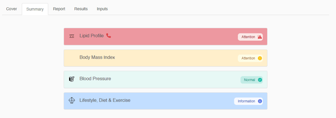
Health category imagery
To better serve our diverse consumer base, we've given our health category icons and consumer report front cover a fresh, modern update. Plus, our summary page now features vibrant, colour-coded health categories for an enhanced visual experience.
Company branding
Admin users can now add or update their company brand colours. Navigate to the branding page to add your hex code, or use the eye dropper tool to add your primary colour to the consumer booking page.